Betty Brinn Children's Museum
A Design and Visual Communications I project that required students to visually rebrand a local Milwaukee business of our choosing to align with
a different brand archetype. I chose to transition Betty Brinn Children's Museum from a Creator archetype (values focused on innovativeness, creativity, and expression) to a Jester archetype (values focused on fun, connection, and playfulness).
Type
Branding Identity
Role
Graphic Designer
People
Solo
Duration
10/24 - 12/24
Audience
Young Children & Parents
Goal
Rebrand a local Milwaukee business

The Hop
An intro to graphic design project where students rebranded a company of their choice using an animal as the central aspect of their logo. This project rebrands The Hop, a fixed-transit streetcar network in downtown Milwaukee, Wisconsin.
Type
Branding Identity
Role
Graphic Designer
People
Solo
Duration
02/24 - 05/24
Audience
Young Milwaukeeans
Goal
Invite commuters to explore Milwaukee
Down to The Wire
Down to the Wire was the name of my exhibit within my senior design showcase, CNVRGE. In this project, students were asked to explore their take on the meaning of speculative design, creating brands and print media that could visually represent the futures we created. Then, we would work as a collective to design, promote, and install the necessary materials to hold a gallery event showcasing our work. The future I designed for the showcase is based on the research question: What if in a post-war American society, the wealthy take pills to regain the biological benefits of empathy only to realize that there is no shortcut to building meaningful connections?
Type
Brand Design & Print Design
Role
Graphic Designer &
Wayfinding Team Lead
People
Collaborative
Duration
09/25 - 12/25
Audience
Friends, Family, and
Showcase attendees
Goal
Develop and design a
speculative future


Education Haven
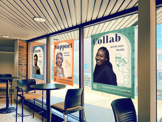
This project was a Typography II assignment in which students worked in teams of four to create a brand that addressed a modern societal concern. My team's concern was the lack of assistance teachers receive when they first begin interacting in-person with children. The goal for creating this brand was to offer teachers a support system to lean on in moments of need so their struggles don't trickle down to the kids they teach.
Type
Brand Design
Role
Graphic Designer
People
Collaborative
Duration
01/25 - 5/25
Audience
Teachers & Administrators
Goal
Design a brand that supports teachers

Personal Logo Design
My personal logo is a combination of the overlapping uppercase serif letters D and J in medium Bodoni font utilizing the colors navy, yellow ochre, and white. Together, the letters D and J stand for Danielle Jacobs Illustration and Design with the D representing both Danielle and Design and the vertical line of the D representing the I of the Illustration. I chose the serif font because I wanted my business to embody a reliable and timeless tone while relating back to my personal interest in publication design. I decided on a limited color palette to exude a refined and organized personality which I reflect through my work style.
Type
Logo Design
Role
Graphic Designer
People
Solo
Duration
06/24 - 9/25
Audience
Those interested
in my services
Goal
Design a logo to represent my work & brand
STARBASE
STARBASE is a Department of Defense youth program that engages 5th grade students in hands-on experiences that prepare them for futures in STEM.
This design is a rebrand I was hired to do of the original concept including the original logo paired with new requested imagery.
Type
Logo Design
Role
Graphic Designer
People
Solo
Duration
06/24 - 7/24
Audience
Teachers & Administrators
Goal
Redesign the current STARBASE logo


